Beacon
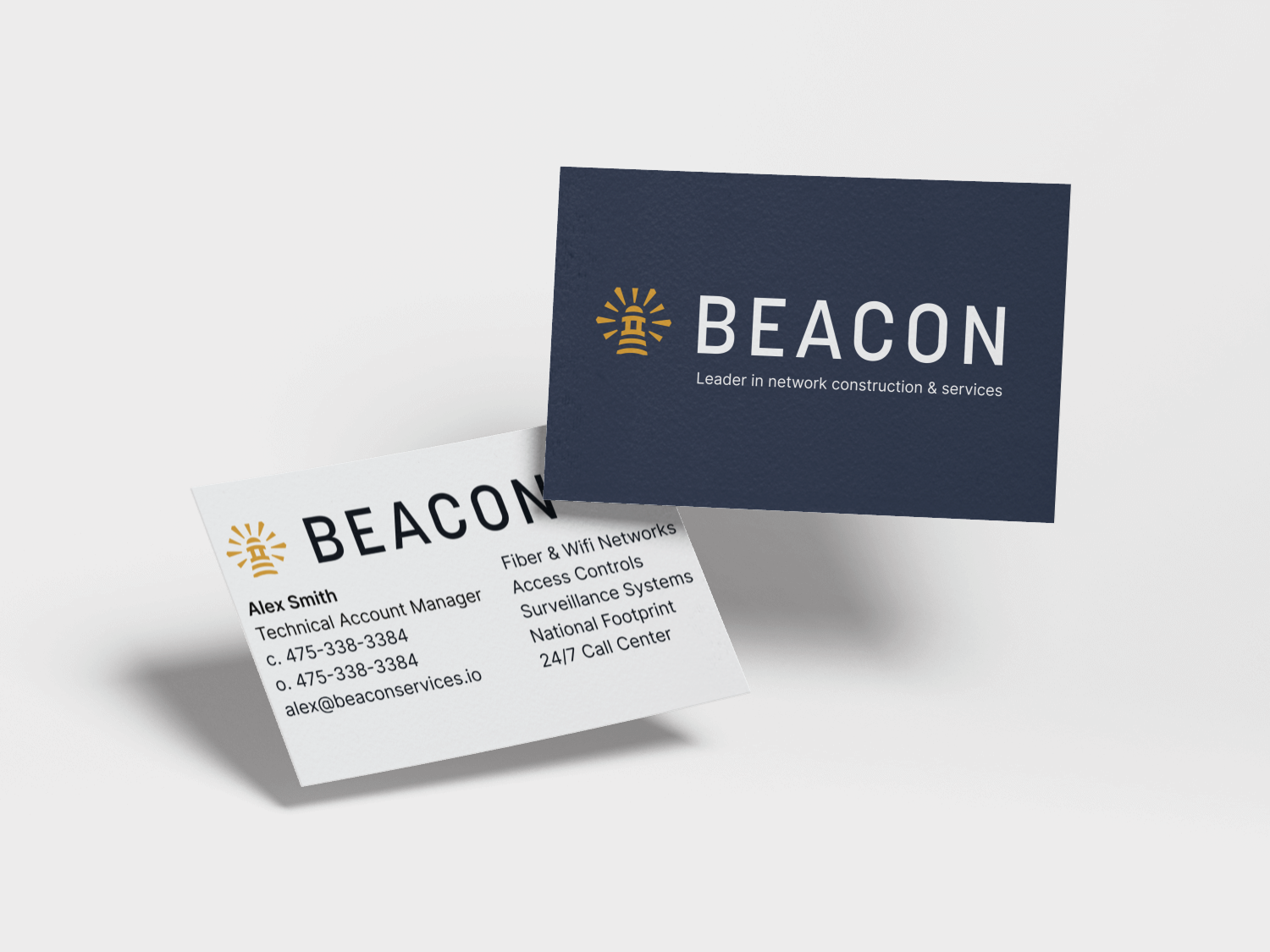
Beacon is a tech company that originally focused on installing wifi networks for marinas. As the business grew, they began expanding their services and working across more industries. While their offerings had evolved, their visual brand hadn’t kept pace. They had an existing lighthouse logo that was well known in the industry but felt dated. I was brought on to refresh the brand and help it better reflect where Beacon was headed.
A modern & trustworthy brand identity
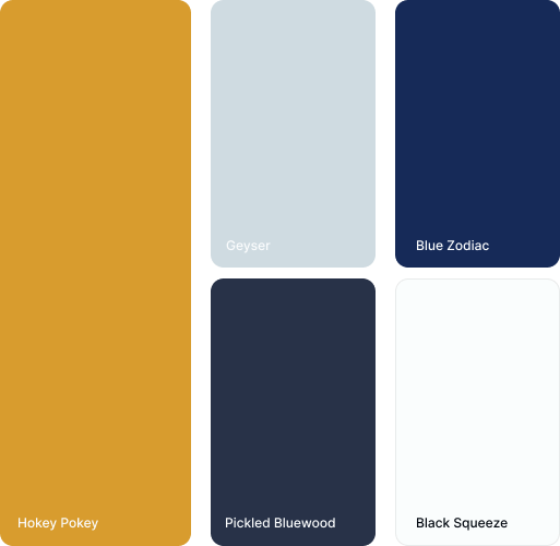
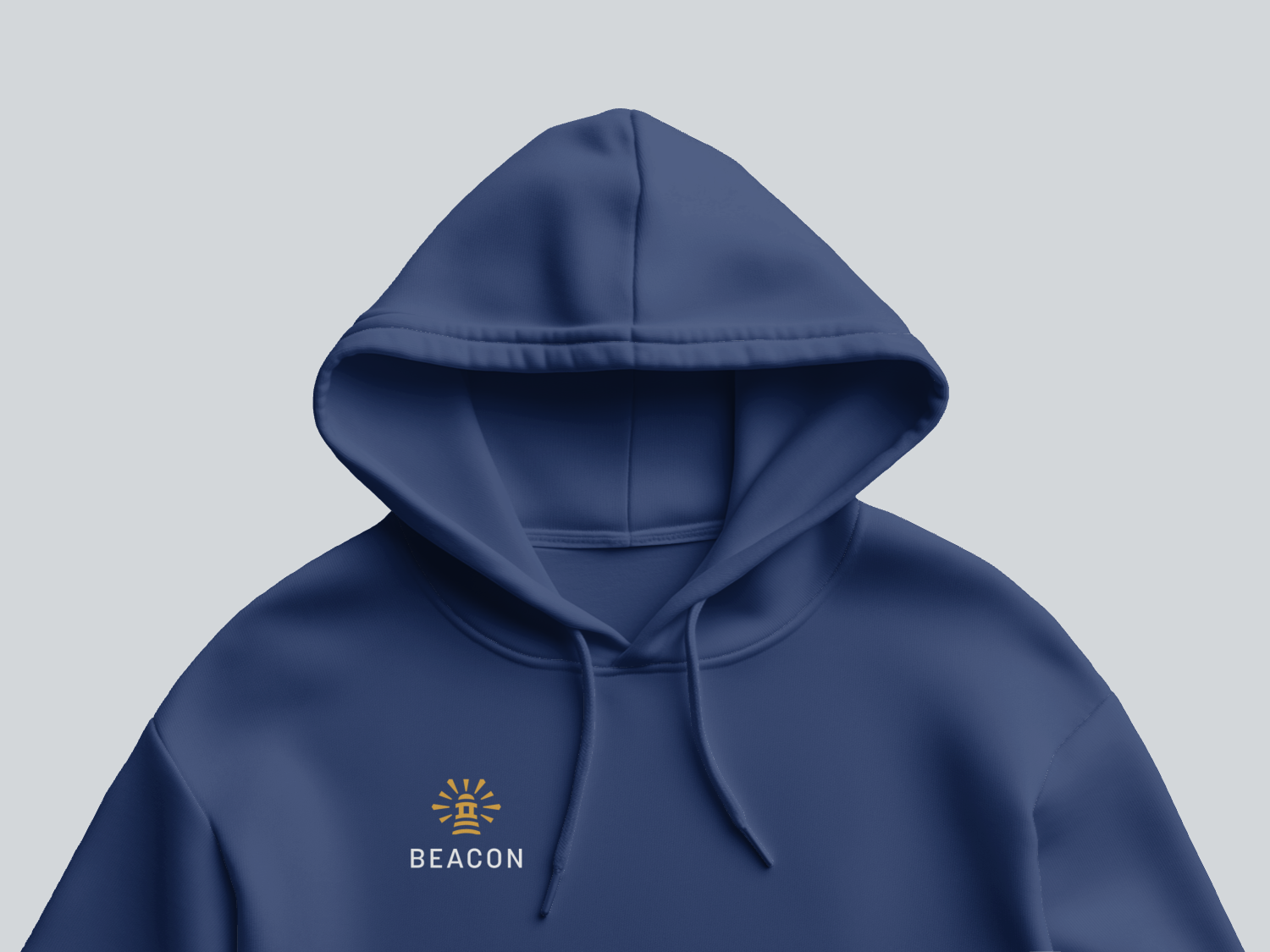
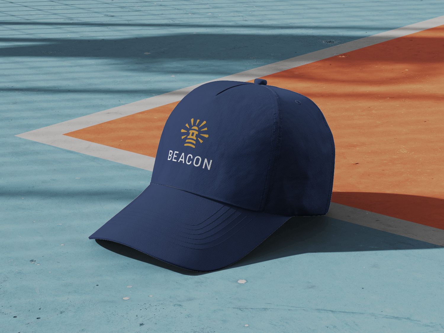
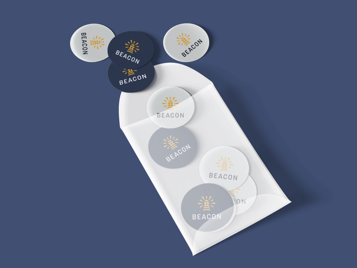
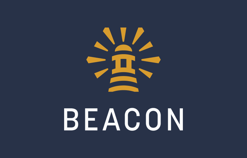
Because the lighthouse was already familiar in the industry, we chose to keep it and reimagine it instead of starting from scratch. The goal was an elevated, tech-forward look that still felt grounded and trustworthy. Blue is everywhere in marina and aquatic brands, so we intentionally moved away from it as a primary color. Instead, we landed on a burnt mustard tone—bold, confident, and distinctive, paired with a deep navy that feels solid and reliable. The updated logo is more graphic and intentional, and it now shows up everywhere Beacon does. The result is a brand that feels versatile, recognizable, and ready to grow alongside the business.