Roll Call App Design
Contributions
I designed Rollcall’s initial product concept screens, including the entire data visualization system and core mobile interface. I created the early sketches, explored multiple visualization directions, and delivered polished high-fidelity screens for both candidate and employer experiences. I also designed Rollcall’s logo (shown in a separate case study). My work helped shape how Rollcall communicates compatibility, culture, and personality through data.
Overview
Rollcall is a mobile-first platform built to match job seekers with companies based on culture, personality, and psychometric data. It’s a two-sided marketplace that delivers meaningful value to both candidates and employers by helping each understand how—and why—they’re a strong fit for one another.
Understanding the Problem
Rollcall needed a way to visually communicate complex psychometric and cultural data in a format that felt intuitive on mobile. Both candidates and companies needed to see their “professional DNA” at a glance and understand how they matched.
I began with competitive research into how other platforms visualize skills, traits, and cultural values. Most solutions relied on charts or lists, but none captured depth, personality, or the emotional side of job matching. This confirmed Rollcall had the space to create something fresh and meaningful.
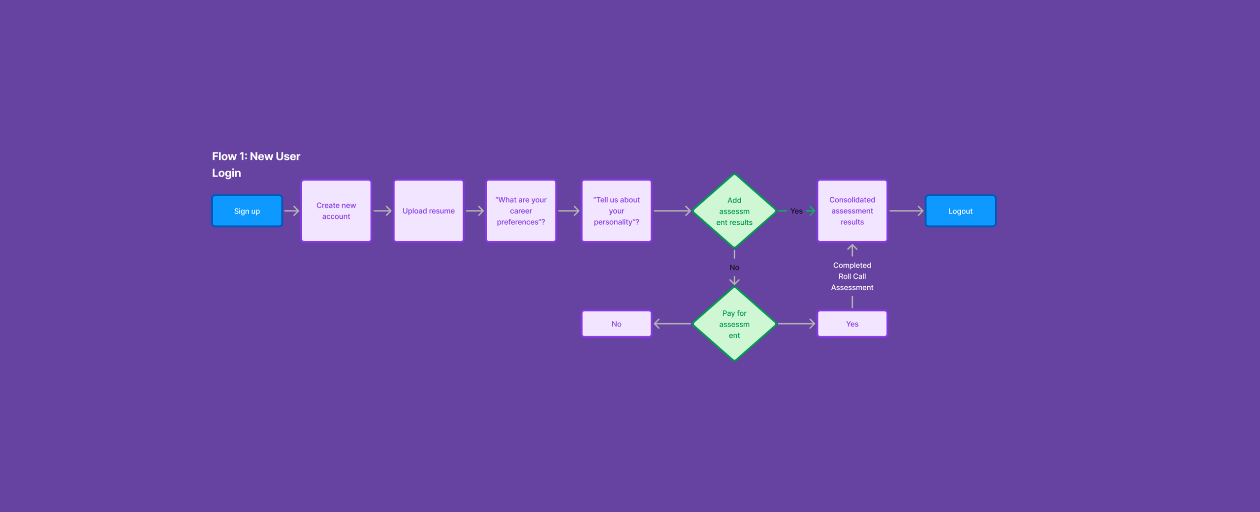
What the Experience Needed
The experience had to clearly show:
1. A candidate’s values, skills, personality traits, and work styles.
2. How those traits matched a specific company.
3. How companies could view the same data from their side.
Because Rollcall is mobile-first, all data presentations needed to be touch-friendly, legible at small sizes, and emotionally engaging. This became the foundation for the interface direction.
From sketches to a visual system
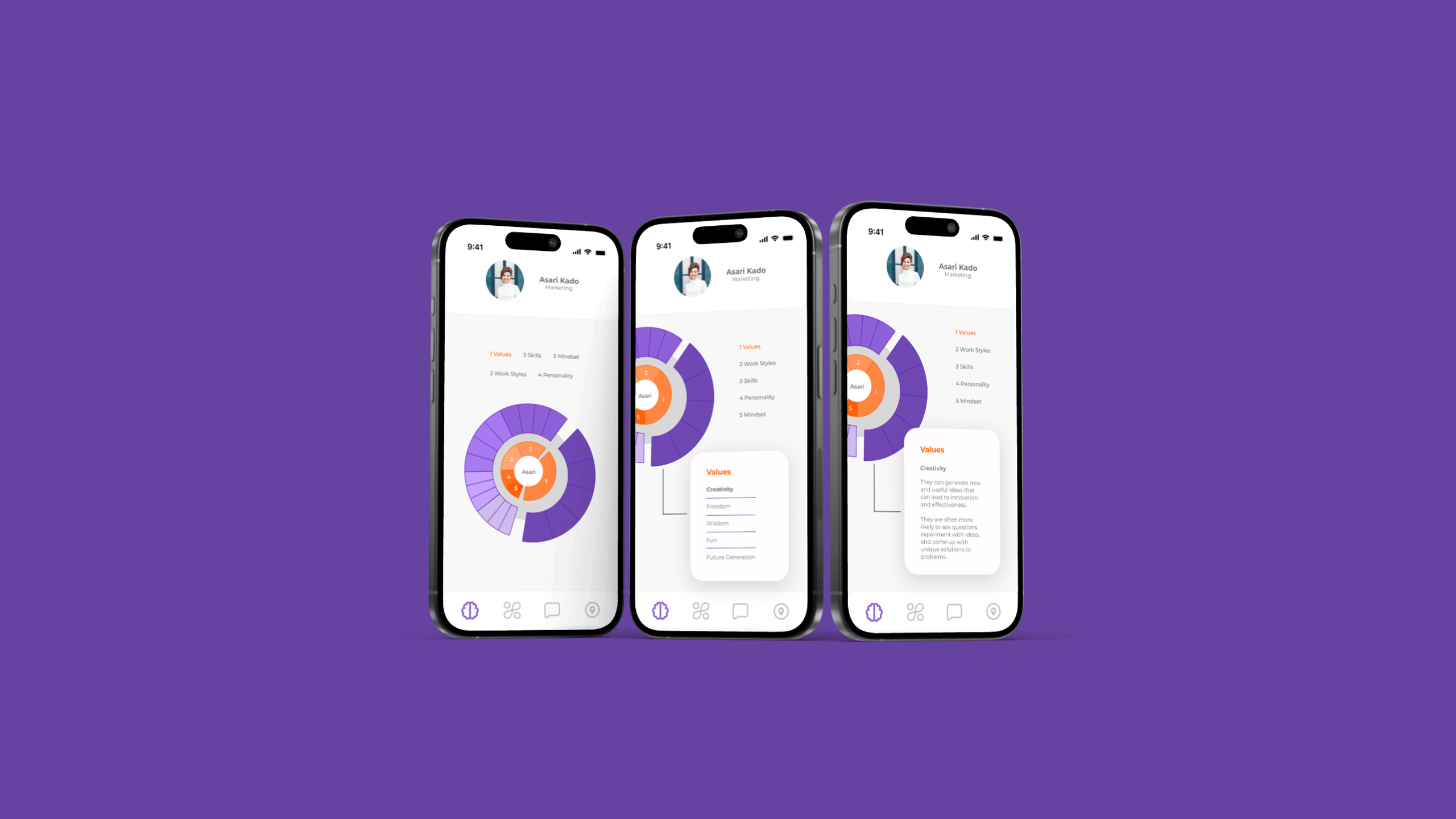
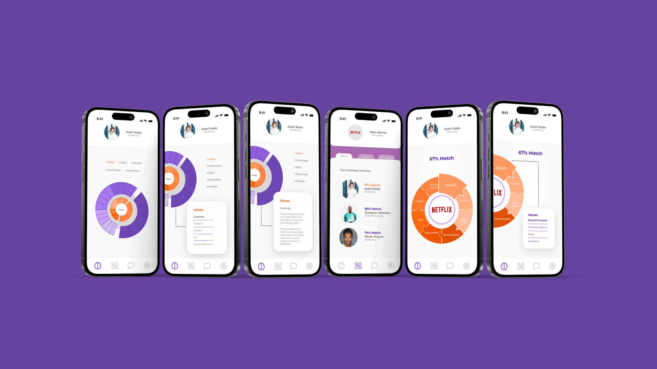
I began sketching ideas for how to represent layered data in a way that felt intuitive. The first iteration explored interactive circular bubble segments that expand to reveal deeper insight for each category. These evolved into the ring-style data visualizations seen in the final designs.
Since this was a conceptual project, the goal was to show what Rollcall could become, not build the full app.
Early Concept
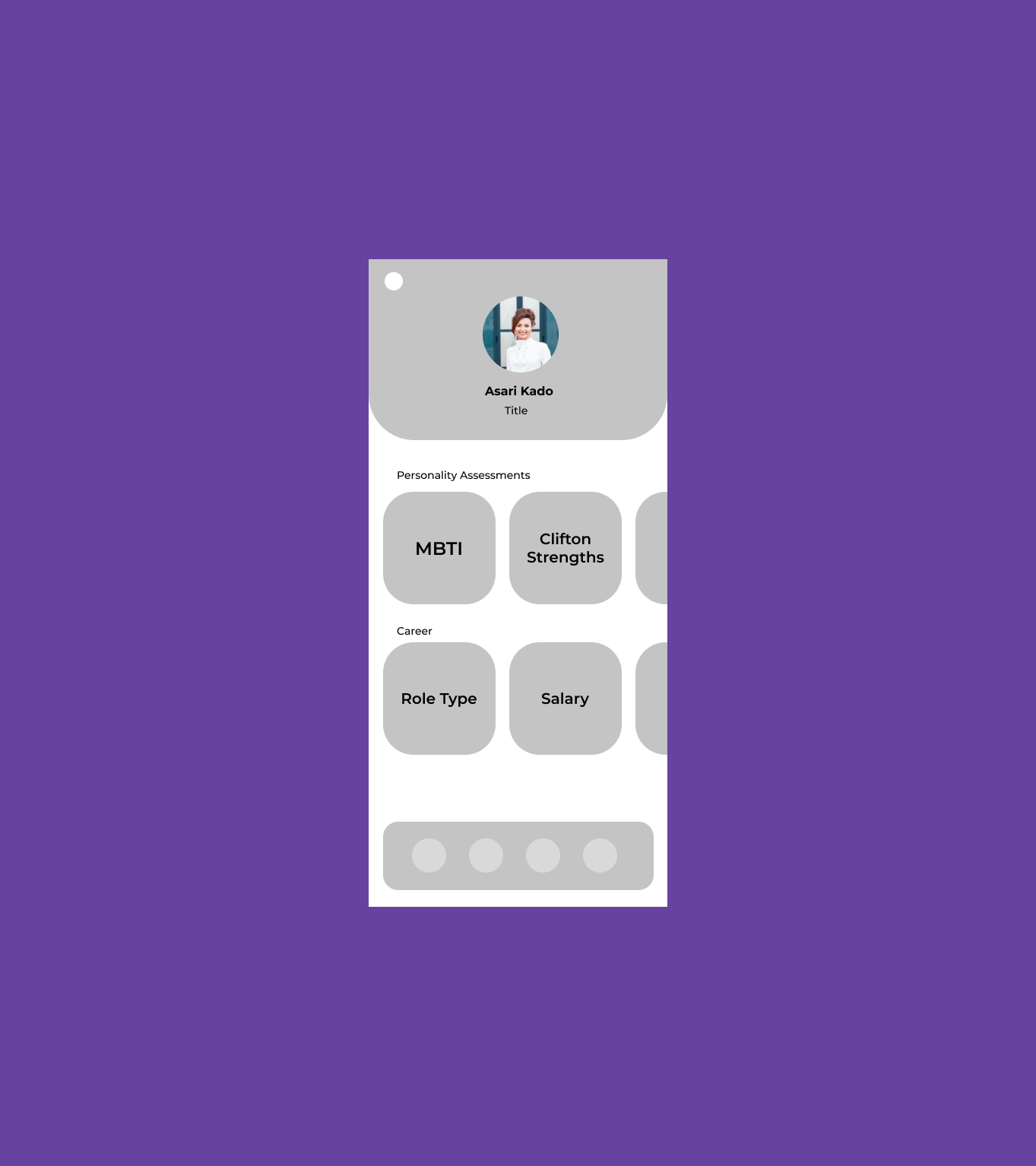
I started with a basic card-based layout to explore what information mattered most and how users might scan personality and career data at a glance.
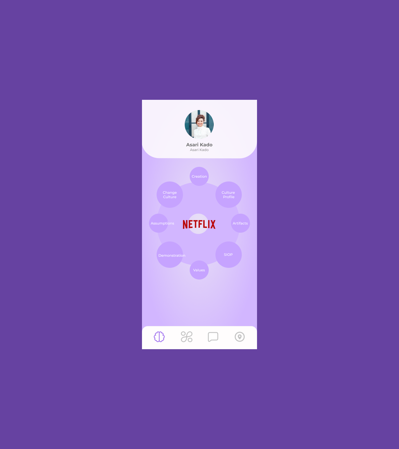
Exploring Visual Metaphors
I introduced a circular diagram to visually group related attributes, helping users understand how different traits connect to a single profile.
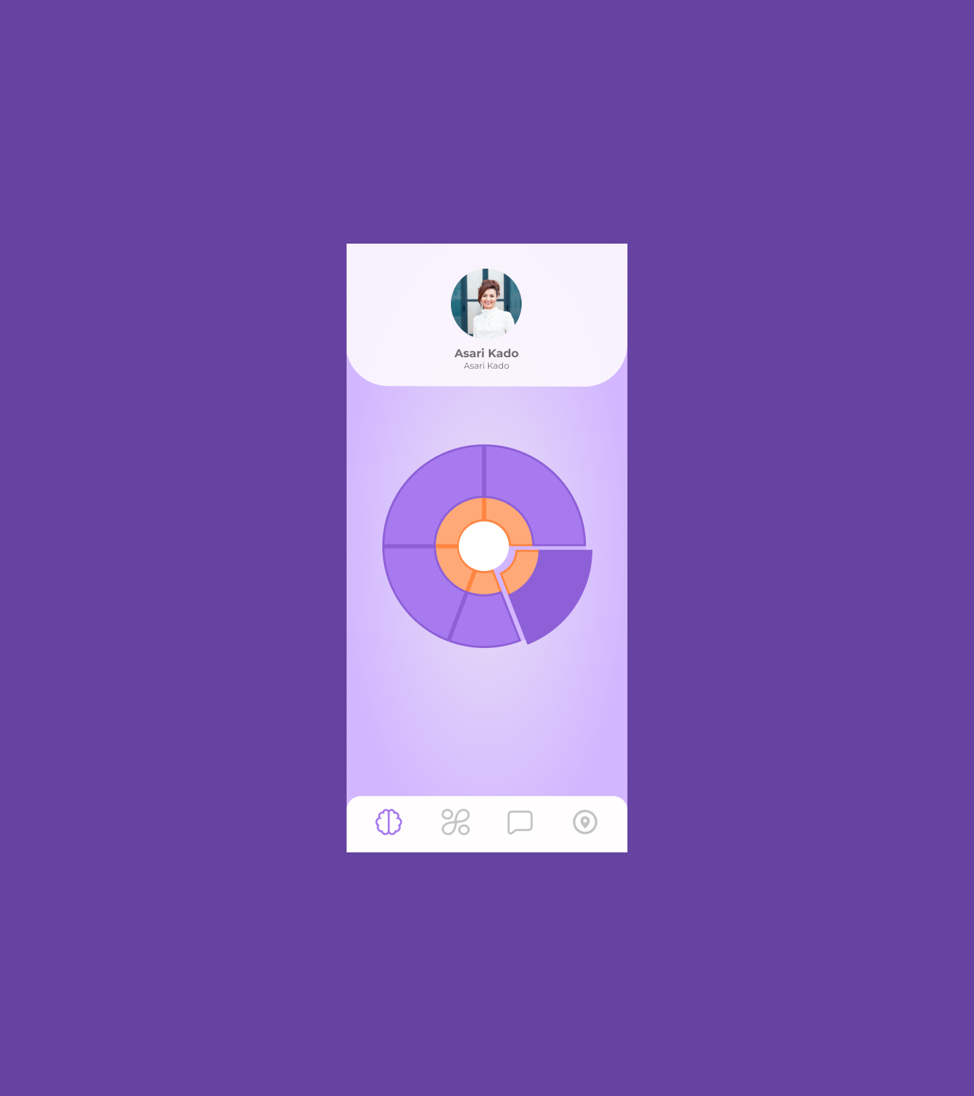
Refining the Data Visualization
I refined the chart structure and color hierarchy to make individual segments easier to read and to better distinguish between data categories.
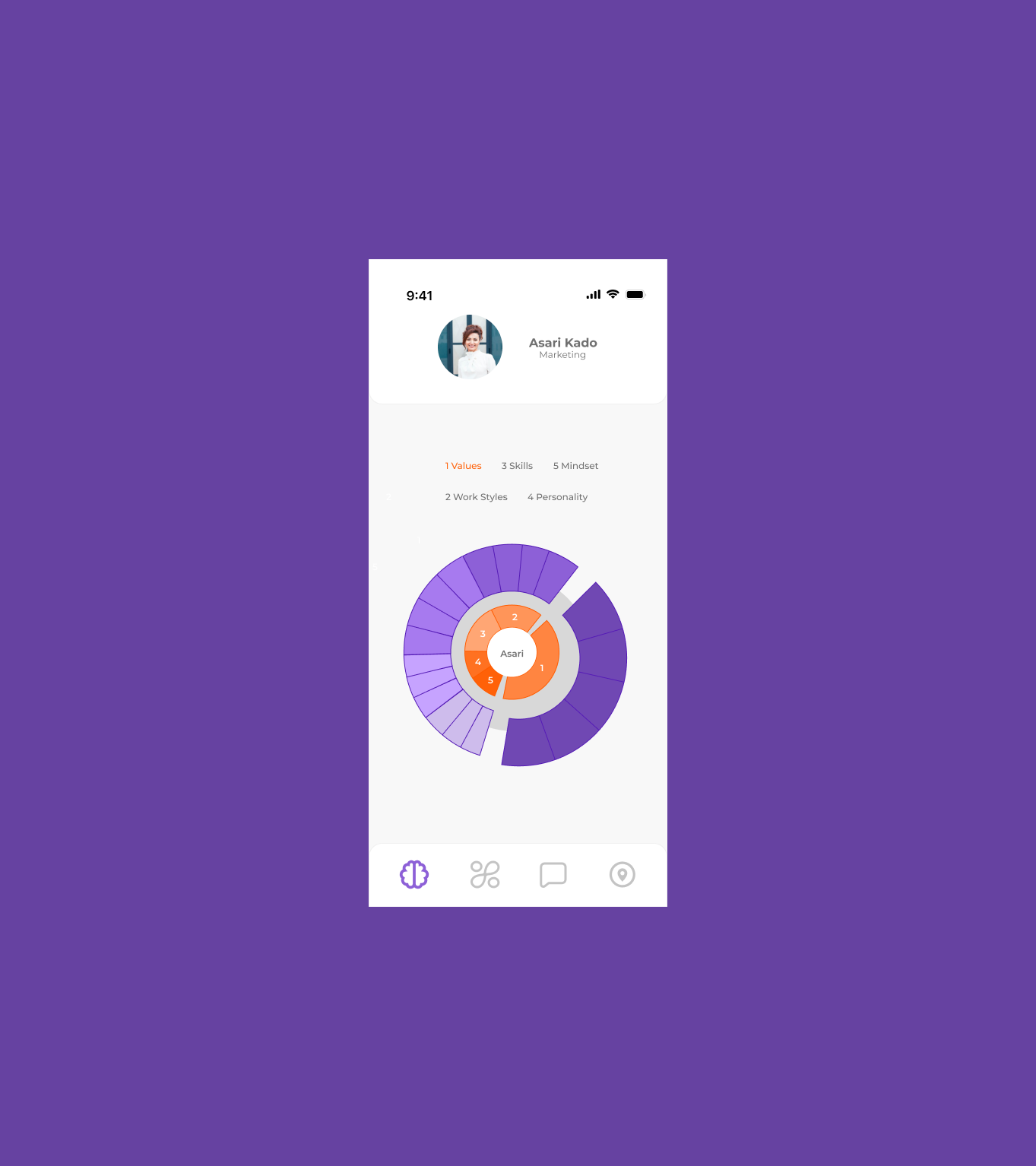
Clarifying Meaning & Interaction
I finalized the visualization by adding labels, hierarchy, and clearer segmentation so users could quickly understand what each section represents and why it matters.
Bringing data to life
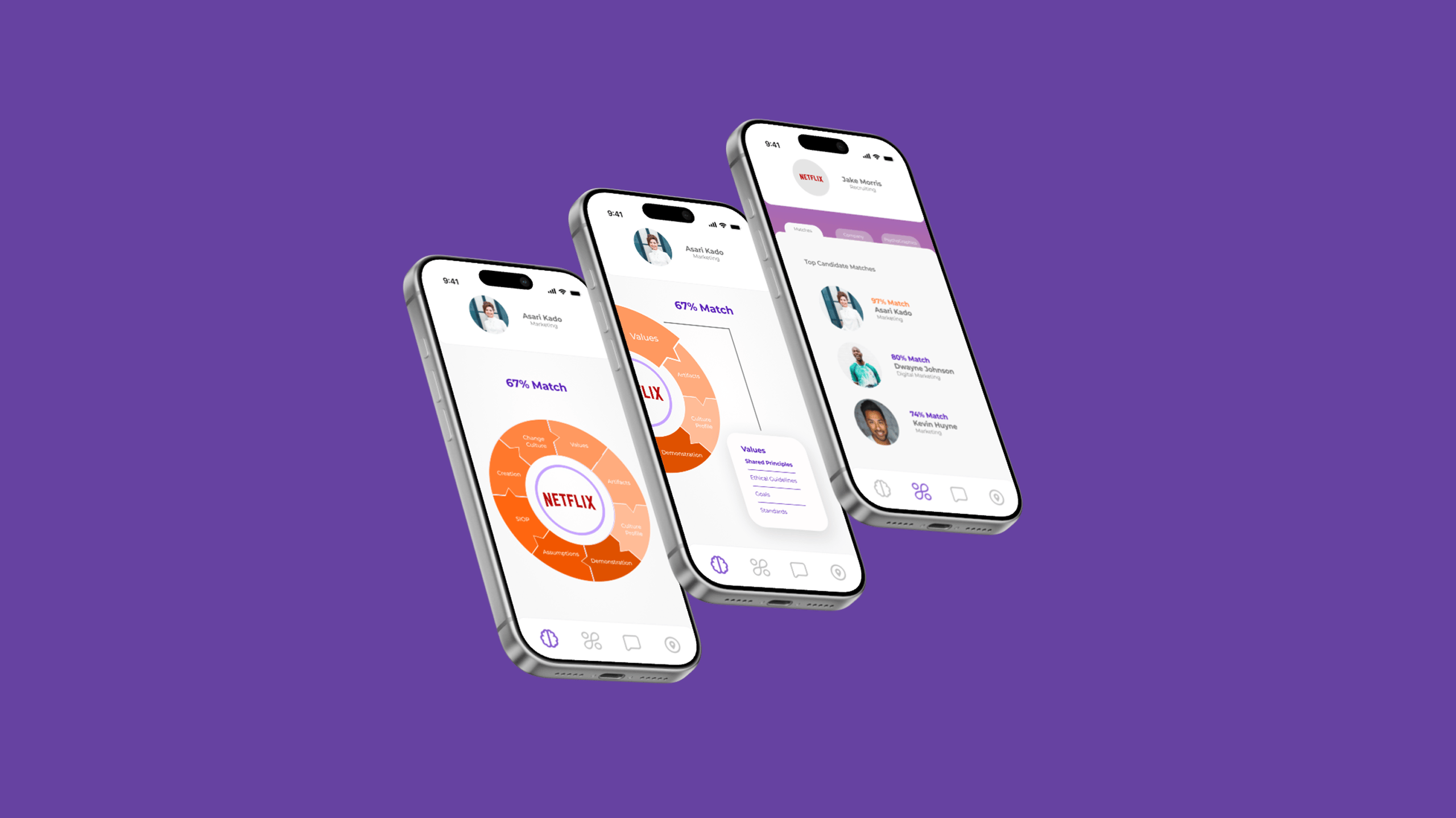
Once the visualization direction was set, I focused on creating a set of high-fidelity mobile screens. The goal was to make the system feel clean, expressive, and easy to navigate.
I designed:
1. A compatibility match screen showing overall match percentages
2. Interactive, multi-layered rings that visually map relationships between traits
3. A candidate profile that highlights strengths and personality
4. A company view that mirrors the candidate experience
5. Overlay cards that reveal details for each psychometric segment
These designs helped Rollcall communicate its value to both investors and early partners.
Bringing data to life
Final Outcomes
The final screens gave Rollcall a clear, compelling visual direction for its matching product. The data visualization system made complex psychometric information feel approachable and interactive. The mobile-first UI demonstrated how candidates and companies could explore compatibility using a single shared framework.
These designs helped Rollcall articulate its vision, share the product with partners, and begin planning development for a fully functional app.
FAQs
Answers to common questions about my design approach and process.
I start with deep user research, breaking down complex problems into simple, elegant solutions. Every design begins with understanding human behavior and needs.
Minimalism meets functionality. I believe great design should be intuitive, removing barriers and creating seamless user experiences that feel natural and effortless.
Yes. My experience spans healthcare, e-commerce, and digital wellness. I adapt my design approach to each unique challenge and industry context.
I leverage industry-standard tools like Figma, Sketch, and Adobe XD. My toolkit is always evolving to match emerging design technologies and methodologies.
Project timelines vary based on complexity. Typically, a comprehensive UX design project ranges from 4 to 12 weeks, ensuring thorough research and iteration.