Noni Digital App Design
Overview
Noni Digital is a platform that helps users create a digital estate plan. When I joined the project, users were signing up but not completing the steps required to set up their estate. The main issues were unclear next steps, confusing terminology, and a product flow that didn’t guide people through what can already feel like an intimidating process. My goal was to redesign the platform using the existing brand system, improve the user experience, and rewrite key areas to make the product more approachable and actionable.
Learning the Problem
I began by reviewing Noni’s existing user survey data. Most users didn’t know where to begin after signing in, and the platform offered little guidance. Many weren’t familiar with estate planning terminology, which created additional friction right at the start. I also reviewed competitors to see how similar products onboard users and introduce complex financial or legal tasks.
Clarifying the Direction
Based on the research, it became clear that Noni needed a clearer starting point along with a progressive onboarding flow to guide users step-by-step. Users needed to understand what to do first, what came next, and why each step mattered. Keeping the brand intact, I focused on restructuring the experience to feel more intuitive, supportive, and less overwhelming.
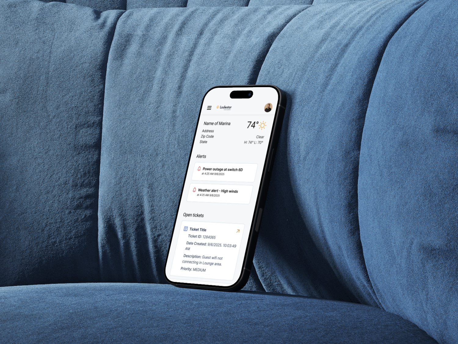
Design Phase 1: New Onboarding (V1)
I created mid-fidelity onboarding concepts inspired by products like TurboTax, where complex processes are broken down into small, friendly steps. I introduced clearer language, definitions for unknown terms, and screens that walked users through their first actions inside Noni. These initial mockups helped stakeholders visualize a more human, accessible onboarding experience that matched user needs.
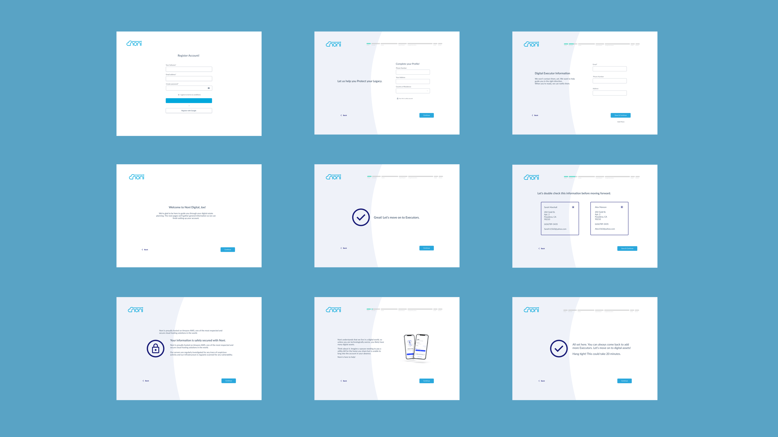
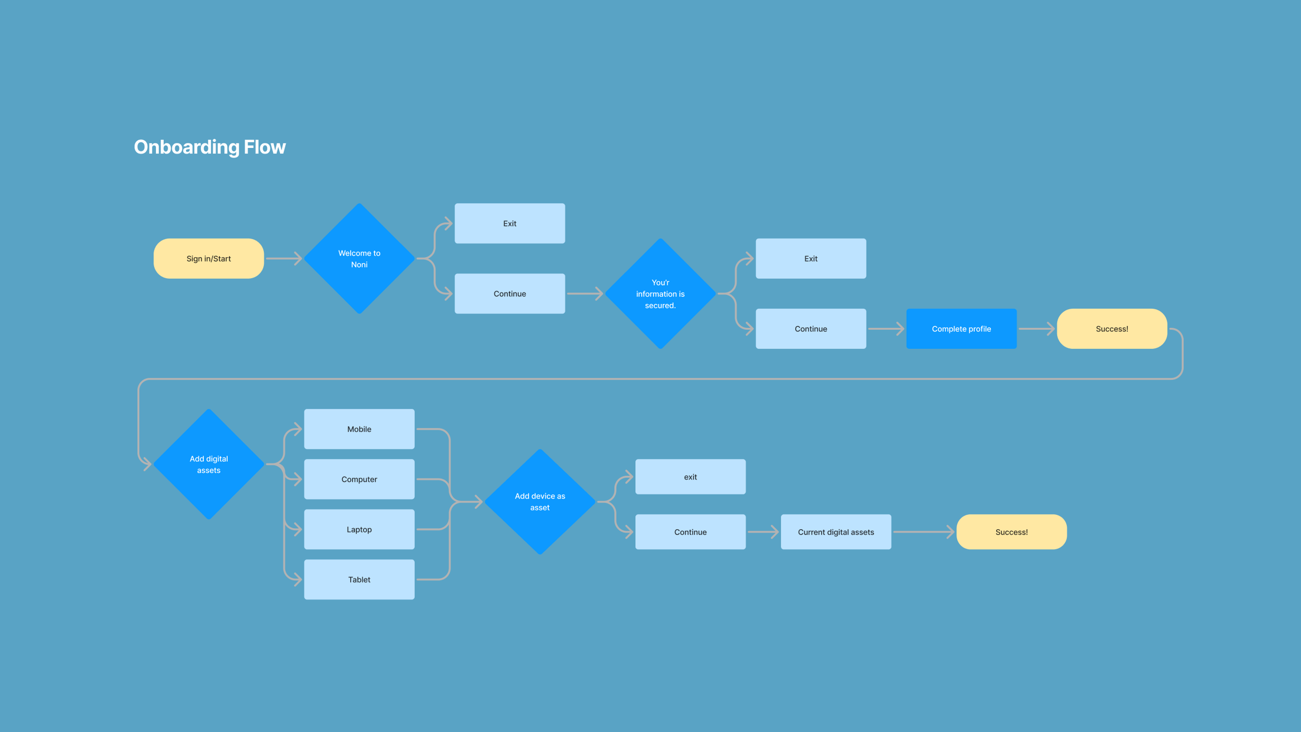
Design Phase 2: Expanded Onboarding (V2)
In the next iteration, I expanded the onboarding into a full end-to-end flow that incorporated new UX writing throughout the product. This version introduced educational moments and a step-by-step sequence for setting up an estate plan. Stakeholders were concerned that the flow felt too long, so we created a streamlined, fast-track version focused on the three most essential flows.
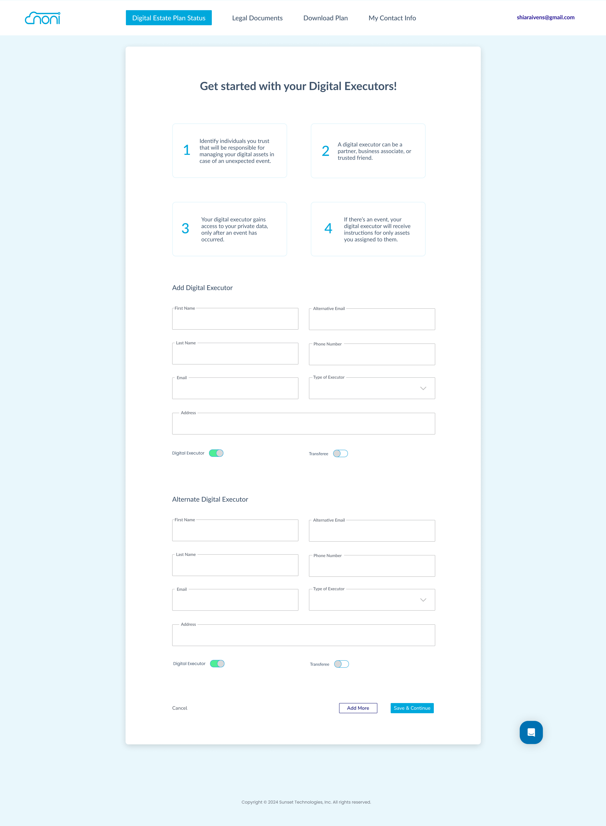
Digital Executors Setup
I designed a simple, step-by-step flow that helps users add primary and backup digital executors, clearly explaining what each role does and when access is granted.
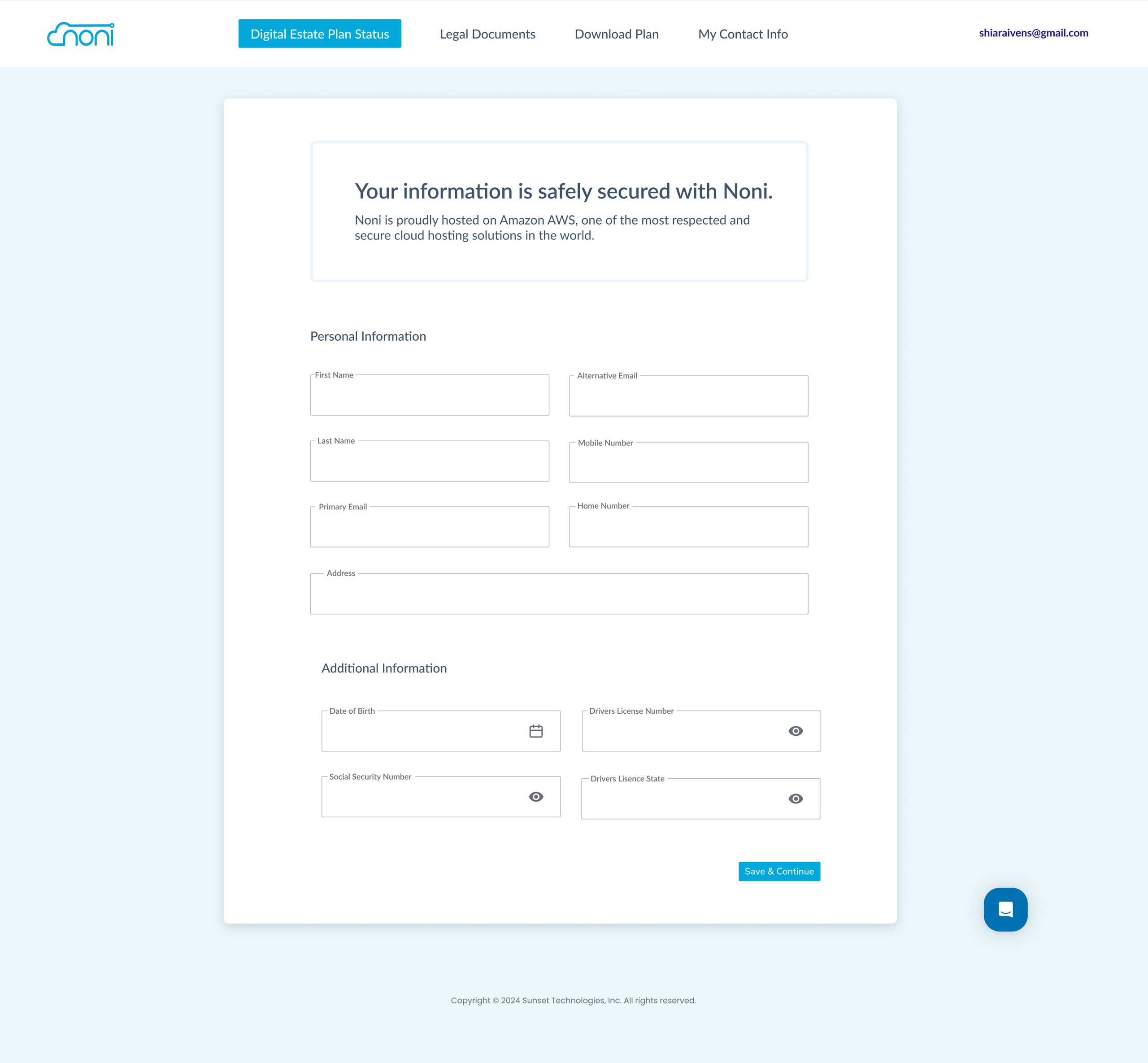
Personal & Secure Contact Information
I built a clear, easy-to-complete form for collecting sensitive personal information, supported by security cues that reassure users their data is protected.
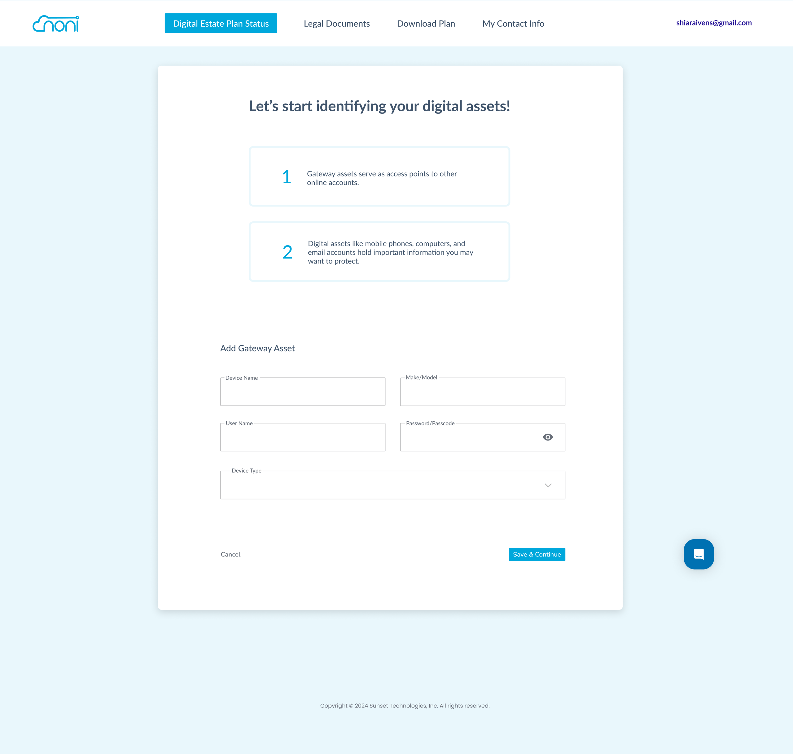
Gateway Assets Identification
This step to help users quickly document key gateway assets, like devices and email accounts, so access to their digital life is clearly organized.
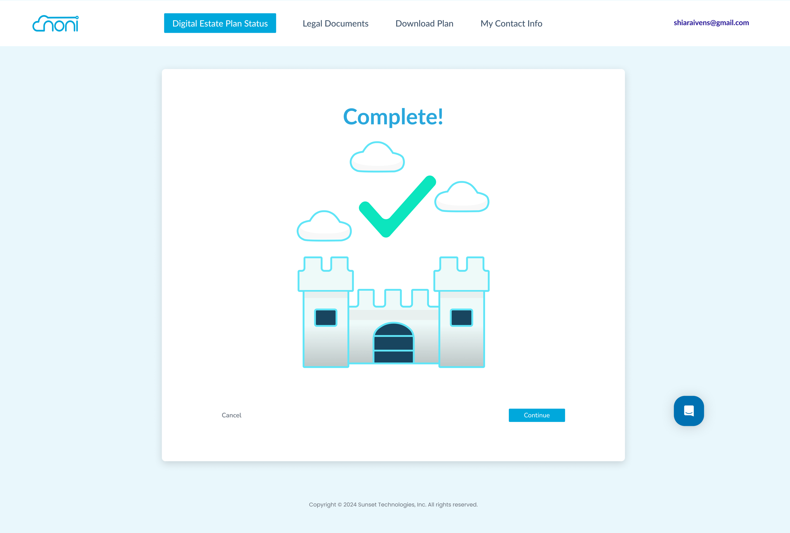
Final prototype and handoff
This prototype became something the team could confidently present to partners and potential companies.
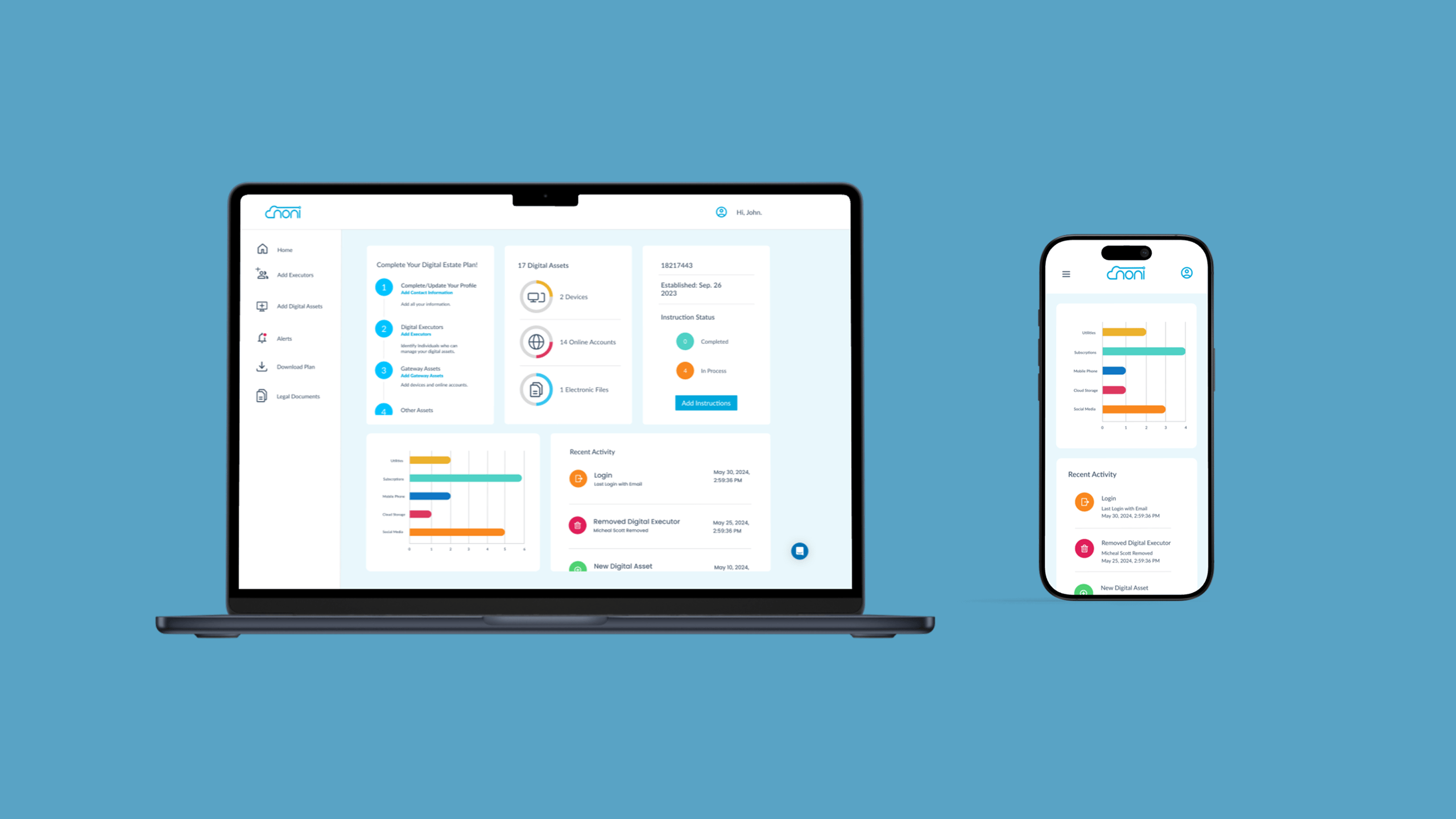
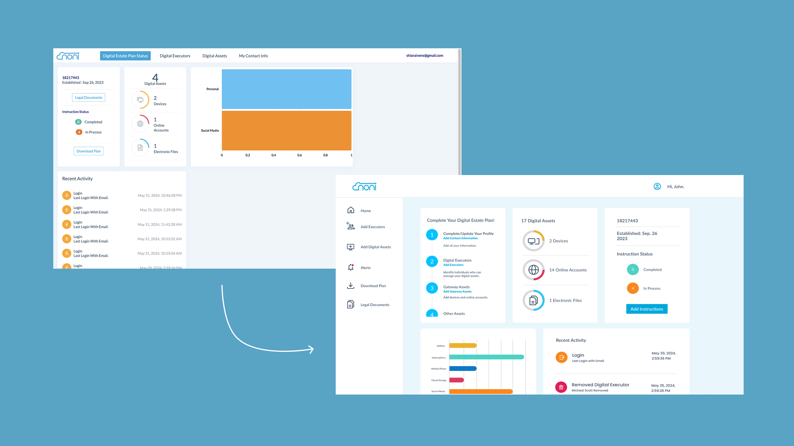
Design Phase 3: Dashboard Redesign
Once onboarding was moving in the right direction, I redesigned the dashboard, which also serves as the homepage. Using Noni’s current styles, I reorganized the content structure to highlight priority actions and show users what to complete next. I introduced a sticky sidebar for easier navigation, replacing the original top navigation, and used consistent typography with intentional weight and color changes to guide the user’s attention. The dashboard now prompts users to complete their estate plan with a clear first card that walks them through tasks in a recommended order, visually represented as steps.
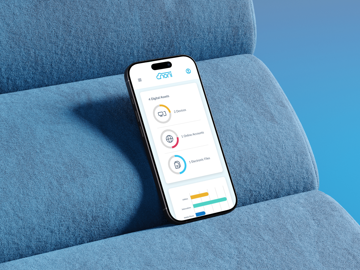
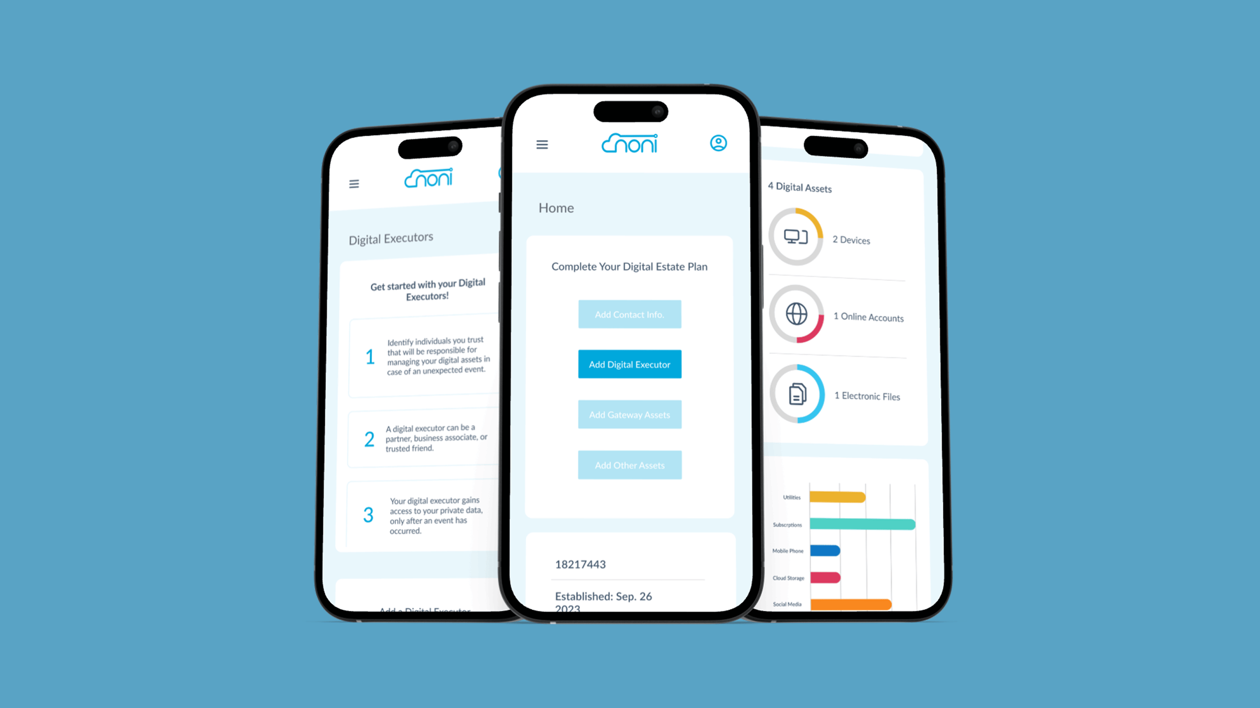
Mobile Experience: B2C Version
For the consumer-facing version, stakeholders wanted a strong mobile experience. I adapted the flows to work cleanly on small screens, focusing again on clarity, simplicity, and removing unnecessary friction. The mobile experience supports users in completing their estate plan with the same guidance and language improvements introduced on desktop.
Outcomes
The redesign created a much clearer and more intuitive user flow. Users now understand where to start, what to do next, and why each step matters. The improved language reduced confusion around estate planning concepts, and the new dashboard gives users instant visibility into their progress. The team gained a polished prototype that could be shown to potential partners, and the updated mobile experience supports future B2C expansion.
More projects
FAQs
Answers to common questions about my design approach and process.
I start with deep user research, breaking down complex problems into simple, elegant solutions. Every design begins with understanding human behavior and needs.
Minimalism meets functionality. I believe great design should be intuitive, removing barriers and creating seamless user experiences that feel natural and effortless.
Yes. My experience spans healthcare, e-commerce, and digital wellness. I adapt my design approach to each unique challenge and industry context.
I leverage industry-standard tools like Figma, Sketch, and Adobe XD. My toolkit is always evolving to match emerging design technologies and methodologies.
Project timelines vary based on complexity. Typically, a comprehensive UX design project ranges from 4 to 12 weeks, ensuring thorough research and iteration.